Sitting in front of your laptop screen and browsing websites have become the new normal in 2020.
And this dynamic shift from office to home has led to changes that one could not have imagined so early.
With black and white home pages and the use of animated transitions have ruled the year 2020.
However, the expectations for the new year in the graphic world is altogether a different ball game.
This year, designers are coming up with designs that are not just user friendly but are a perfect match to the current setting we all are witnessing nowadays.
The challenge of maintaining a work-life balance, ensuring our own health, and avoid stressful situations.
So let us take a look at some of the most promising trends for the coming year!
Dynamic Homepages
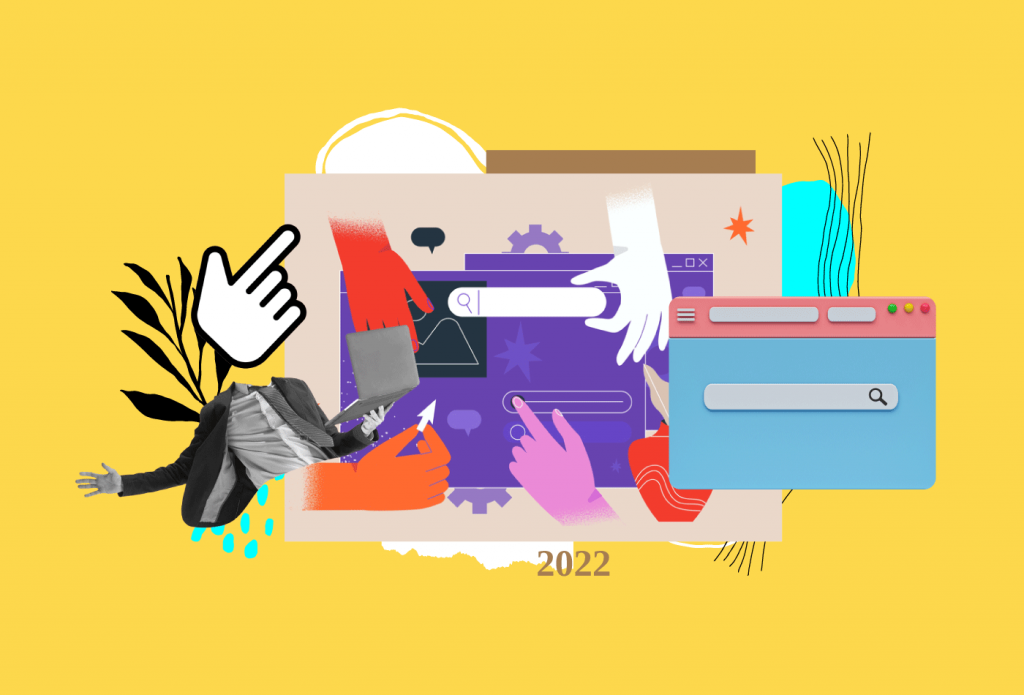
The feel of homepages and so-called landing pages have transformed drastically.
With the incorporation of videos, transition, light and cool colors have become a new trend.
By avoiding the regular and historical format for websites, the introduction of inbuilt chatbots customized according to the website and altogether with a new feel, every time you visit the same website is what holds the audience attention.
This eye-catching and unique feature, on one hand, made the website an easy and go-to option for the users, it has also reduced the stress and strain on eyes with the use of a light color palette.
These inbuilt features are making website homepages dynamic and interesting for all types of visitors.
Modern Minimalism
Minimalism is the game-changer. However, it is not a new concept altogether but, it is predicted to use much more than what has been done till now.
The idea of presenting and conveying more information using less and minimum number of graphics is what fits best in the current times.
It not just keeps the look clean and simplistic but has a lot of hidden benefits.
- It calms your mood and instils the lost energy with the use of customized creatives.
- It reduces excessive eye-straining and keeps them healthy.
- It helps to highlight the importance of tabs and figure the essential information faster and quicker.
- It holds the attention of the audience and increases their time spent on such websites.
Source: Bluecompass
Scrolling Animation
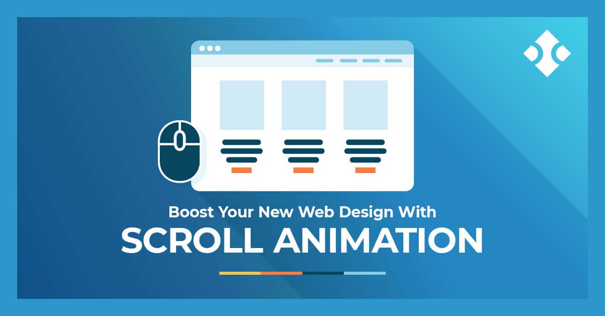
Scrolling animation is the newly introduced concept where new icons and directions are used for scrolling purposes.
Unlike the traditional approach of vertical scrolling, horizontal, diagonal and animated scrolling are the newly introduced.
This practice helps to break he monotonous practice and activates the user. It excites and engages them so well that the user starts enjoying their search at times.
It also helps to increase the overall time they spent over a particular website. Hence scrolling animation seems to have a good scope over time.
Embedded Videos
Videos have become the most popular form of content over the internet and, YouTube and Netflix are the live examples to justify the same.
With so much potential that videos hold over the internet, web designers have realized the same and started incorporating videos across the website pages.
By using the creativity and beauty of gifs and stock videos, the overall look of the websites, especially the home page has changed to unimaginable heights.
It not just breaks the flow but acts as a relaxing and refreshing break from non-stop training in front of the computer screens.
Nowadays, these videos are designed especially to prevent boredom and reduce the stress of human eyes by incorporating light and fun motions that can be enjoyed by everyone irrespective of age group.
Abstract Art Combination
Have you noticed the use of geometric shapes over websites, nowadays?
Well, some of the websites have started using the concept of geometric patterns in their websites while others will start doing it in 2021.
Source: Julie Flogeac
The trend of using these shapes and adding a punch of transition to it gives a new look and feel to the entire website.
It gives a sharp, radiant and high definition look that at times becomes difficult, even with the best of photographs.
The most important benefit of this design is, it allows you to use any color combination depending upon the brand and its guidelines but it suits all possible color combinations.
These patterns are also not restricted to a particular industry that goes well with it, rather irrespective of the industry you belong to, graphical patterns look awesome with all.
Gradient Colour Scheme
Gradient and light colors are the theme colors for 2021.
Being light and soothing, these colors feel like home even digitally and hence do not cause irritation after long hours of viewing the same.
Just the way, the colors of your room define your energy levels and the mood that you carry, the same ideology goes with websites.
The use of happy colors keeps the mood light and happy for the visitors and helps to promote them in making some valuable contributions on your website.
Well, these are the 6 most happening trends that you will witness in 2021. So get ready to use the same in your website to be a part of the trending 2021 websites list. Or visit Buffalo Soldiers Digital, an ultimate designation for designing your website as per the 2021 trends.
