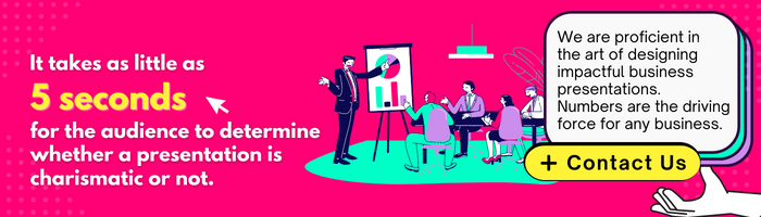
Looking to create a PowerPoint presentation that will really pop?
Forget about fancy fonts and snazzy animations – the key to making an impact is all about color. That’s right, folks, we’re talking about Color Psychology!
Now, we know what you’re thinking: “Color Psychology? That sounds like a load of superficial hogwash!” But hear us out – this stuff is legit.
Think about it – have you ever felt more relaxed in a blue room or more energized in a bright yellow space? That’s the power of color. And when it comes to PowerPoint presentations, using the right colors can mean the difference between a snooze-fest and a standing ovation.
So, grab your color wheel and get ready to learn how to create a presentation that will leave your audience seeing rainbows (figuratively speaking, of course).
But before we dive into the nitty-gritty of color psychology, let’s address the elephant in the room: No, you can’t just make everything neon green and call it a day. Sorry, Kermit. So, put on your serious face and get ready to learn some strategies for using color to make your PowerPoint presentations pop with the pieces of advice from the designers of the best presentation design agency in India.
Alright, Let’s Get Into It!
Color psychology is the study of how different colors can affect our emotions and behaviors. It’s a fascinating field used in marketing, advertising, and interior design for years. But it’s also incredibly useful for creating impactful PowerPoint presentations.
So, how do you use color psychology to create a presentation that will leave a lasting impression? First, you need to understand different emotions and moods associated with different colors. Here are some examples:
- Blue: calming, trustworthy, and professional
- Red: energetic, passionate, and attention-grabbing
- Green: refreshing, natural, and peaceful
- Yellow: happy, optimistic, and playful
- Purple: luxurious, creative, and mysterious
- Orange: friendly, enthusiastic, and confident
Of course, these are just general associations – different cultures and individuals may have different emotional responses to colors. But as a starting point, it’s helpful to keep these general associations in mind when choosing colors for your presentation, as any professional presentation design agency would recommend.
Once you’ve chosen your colors, it’s essential to use them strategically.
Here Are Some Tips For Using Color Psychology In Your Powerpoint Presentation:
- Use Contrast To Create Emphasis
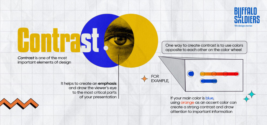
Contrast is one of the most important elements of design. It helps to create emphasis and draw the viewer’s eye to the most critical parts of your presentation. One way to create contrast is to use colors opposite each other on the color wheel.
For example, if your main color is blue, using orange as an accent color can create a strong contrast and draw attention to important information.
- Use Color To Highlight Key Points
Another way to use color strategically is to highlight key points or information.
For example, if you’re presenting data, you could use a bright color like red or yellow to highlight the most prominent numbers or statistics.
- Use Color To Create A Mood Or Tone
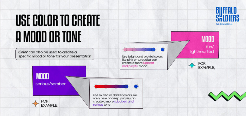
Color can also be used to create a specific mood or tone for your presentation.
For example, if you’re presenting on a serious or somber topic, using muted or darker colors like navy blue or deep purple can create a more subdued and serious tone. On the other hand, if you’re presenting on a fun or lighthearted topic, using bright and playful colors like pink or turquoise can create a more upbeat and playful mood.
- Use Color Consistently Throughout Your Presentation
Consistency is key while creating a polished and professional-looking PowerPoint presentation. Make sure to use your chosen colors consistently throughout your presentation, including on slides, graphs, charts, and images. It will help to create a cohesive look and feel for your presentation.
- Don’t Be Afraid To Mix And Match Colors
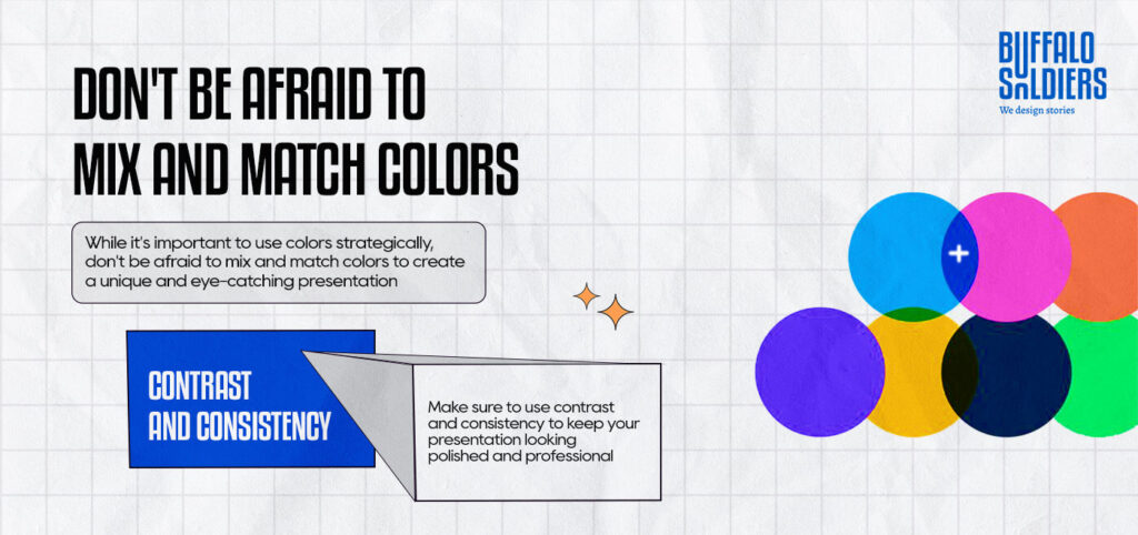
While it’s important to use colors strategically, don’t be afraid to mix and match colors to create a unique and eye-catching presentation. Just make sure to use contrast and consistency to keep your presentation looking polished and professional.
- Use White Space To Balance Out Your Colors
Finally, remember that white space is your friend. Using too many colors can make your presentation look cluttered and overwhelming. Make sure to balance out your colors with plenty of white space to create a clean and streamlined look.
And Therefore…
Are you tired of giving lackluster presentations? Do you want to make a lasting impact on your audience? Look no further than Buffalo Soldiers, a premier presentation design agency in India.
Our expert designers and storytellers work tirelessly to create visually stunning and engaging presentation design services that captivate your audience. With our innovative approach and attention to detail, we will help you deliver your message with impact, leaving a lasting impression on your audience.
Don’t miss out on the opportunity to WOW your audience. Take the first step towards presentation excellence. Act now before your competition beats you to the punch, and leaves you in the dust.
#ProTip: Don’t settle for mediocre presentations – hire Buffalo Soldiers’ PowerPoint presentation design services, and let us take your presentations to the next level. Our unmatched creativity and expertise will help you stand out from the competition and make a lasting impression.