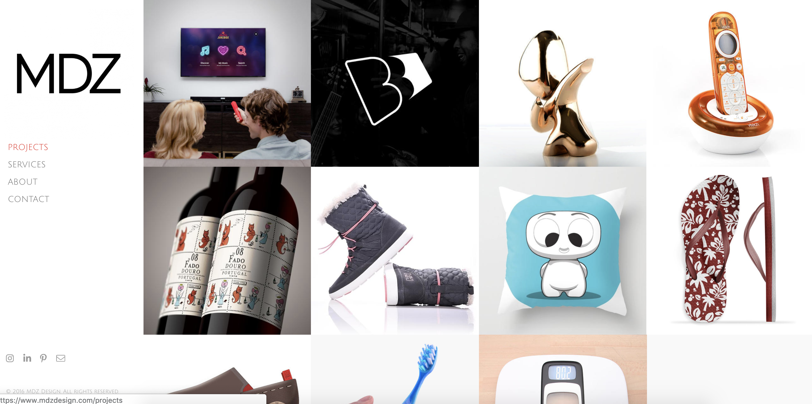
The era of digitization has made our lives so easier! Every industry has in some or the other way benefitted from the advent of digital solutions – graphic designers too!
If you are a graphic designer yourself, let’s me make it clear, your portfolio is your sword.
In the tough competition going all around, it is your design portfolio that will set your identity, your personality, and your scope in the industry.
So, let’s not waste even a single second and understand what makes a portfolio outstanding.
Give it a thought and decide what it should look like
Spend some time and brainstorm. Decide what type of designs really interest you and what types of projects you want to take up in the future.
Decide the area of design that you are passionate about. Is it just web design or logo design or is it the entire gamut of graphic design, that you are interested in?
A clear understanding of this basic concept is the basis for your portfolio.
So ensure that you have a clear understanding of what you want to do as a graphic professional.

Source: HubSpot
Showcase your best work ever
Once you have a clear understanding of which aspect of graphic design you want to take up as a professional, figure out all the work you have done so far in that respect.
This practice will help you analyze all your relevant work and decide which one is the best.
As in the digital world of today, when we just have a few seconds to impress anyone digitally, it is important that we just showcase the best of our work on the front and grab the user’s attention.
Buffalo Soldiers TIP: Do not focus on showcasing all that you have, rather focus on the best that you have.
Crave for quality and not quantity as you can’t afford to waste their valuable time showcasing all that you have done.
Incorporate as much variety as possible
Variety is important. Especially when you are creating a portfolio that will eventually land up with hundreds of clients having different demands.
So by showcasing a variety, you can highlight the dynamic and better option against all those who just have a basic monotonic portfolio.
Buffalo Soldiers TIP: While you incorporate variety, never forget a golden rule that variety is important, but it only looks good if it synchronizes together.
So ensure that every distinct design that you choose to include in your portfolio looks like one big picture rather than pieces of different dishes.
Keep it unique and creative
Being unique and creative is the key!
Look for inspiration from other designers but never try to replicate their work into your portfolio.
Well, this practice makes you a part of the herd that follows the leader.
Try to avoid such common mistakes, rather work upon your ideas and present them in a new fresh way that is just yours.
This distinguishing characteristic is what the client looks for before they hire any designer.

Source: Shutterstock
Add the storyline to make your design speak out
Creating amazing and creative design is important. But what is the use if it can’t communicate what you imagined and thought of while designing the same?
So, to tackle this very issue, try to add the concept, what does it symbolize, when and why did you use it, what was the end result.
Answering these few questions can add a lot more understanding in the minds of the viewer and help them understand your viewpoint better.
Don’t just focus on the end result, rather highlight the process
For some of your designs, try to showcase your entire journey rather than just the end results.
This is a very important practice which not everyone is aware of and uses in their design portfolio.
It speaks a lot about your personality and helps the other person know your style of working and handling things.
Because at times, people focus more on the final resultant output rather than creative process and design thinking.
Let your portfolio talk about your future design imagination
Well, have you ever thought of incorporating your future design plans in your portfolio?
If not, just give it a thought. Usually, people present what they have done in past for their clients, but it is important to understand that it is equally important to present your current work in progress and future design plans if they are really an outstanding impression that you have created.
This new and not so regularly seen element in the portfolio will surely catch the attention of many designers.
One last tip – make sure you show it to one or two people and get their feedback before you finally publish as this can help you crack the nail if you are just a short mile away.
Or catch up with Buffalo Soldiers Digital for top shot design tips and suggestions from our experts who do amazing design work for National Geography, Mahindra University, and IRCTC to name a few of our big clients for design.

