A website is like the online digital identity any individual or an organization holds over the internet, which actually becomes the basis for people to judge and take decisions regarding the business proposition.
Hence, equal emphasis must be laid by everyone out there to regularly update the content and website design, which enhances user experience and becomes the HubSpot to generate business.
To help understand this concept better, let us check out the top 6 award-winning websites across industries and what they did right to achieve their targets.
Zillow
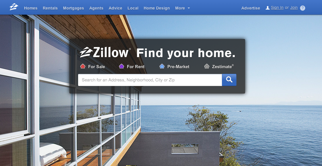
It is a real estate website designed with utmost simplicity which makes it attractive and easy for every user to interact with.
Well, buying or selling a house in itself is a very stressful activity. Hence Zillow has hit these touchpoints by simply mentioning these key services most easily and attractively right on its homepage.

Source: Zillow
The use of contrasting images and the colour combination of purple and yellow is different and distinguishes it from other real estate portals.
So ensure that when you revamp your website, focus on even minute detail as they play a very crucial role in defining the final output.
ESPN Sports Programming
ESPN, as we all are aware is a popular sports and programming website that impresses its users with high definition images and animation.
The placement of call to action buttons at multiple locations right on the home page makes the ESPN website all the more popular and user friendly for every visitor.
The use of background video highlighting the high energetic sports spirit and the presentation of statistics and sports information along with various sports images are key aspects of the overall experience of the website.
So next time when you start planning your website design, focus on incorporating an amazing video that matches the theme and maintains enthusiasm among the users visiting the same.
Revols
It is a product-centric website that deals in earphones.
What makes this website different and unique from the rest of the competition in the emerging market is the use of macro photography.
This technique of macro photography has helped Revols capture small earphones in an enlarged format. Hence reducing the stress on the visitor’s eyes to have a closer look at the product.
This strategy has helped to magnify the product with great detail along with bold and enlarged text for clear and easy visibility.
This comfort of viewing and experiencing the product so closely has made all the difference and helped Revols become an award-winning website design.
Wozber
Have you ever struggled across pages on a website to get the right information you were looking for?
Well, Wozber has addressed this most common, and serious issue through their website.
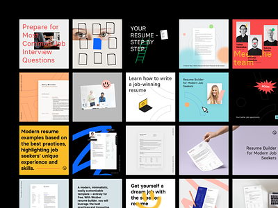
Dealing in CV’s and jobs for the career growth of individuals, it has straightforwardly represented their entire process from building the perfect CV to landing your dream job on their homepage.

Source: Dribbble
A lot of examples from their past clients have also been highlighted very well, which gives a clear idea among the viewers about their services and processes, in just one look.
Quiver
Despite being a smaller website than usual websites, Quiver still managed to become the best of the rest.
What helped Quiver sail through this tough competition is the ability to tap the emotion, just the perfect way everyone feels but never think of seeing it in a real sense.
They, not only displayed the emotions people experience while visiting the website but also ensured that the content they used helped justify the feelings of the images used across all pages of their websites.
So never underestimate emotions as they are the driving force for every activity. Make the best use of the same in your content, and you are all set to rock the internet with your super amazing website.
Toggl
The power of customized animation is the secret behind Toggl.
Animation has worked liked wonders for Toggl which is not just capturing the attention of every website visitor but is giving an amazing overall experience which forces them to spend more time on the website.
The attention to even the slightest detail of animation, like, the way a page should fade away, what animation can be used to display content? Ensuring that it does not become too much or too less for the audience and, focuses on many other such details has helped Toggl ace and win awards.
So never underestimate the influence of animation as it is not just for fun but can do wonders when used wisely.
These are the top 6 websites that teach us 6 secret sauces that have contributed to their success.
We all the best on your journey towards website design, and don’t hesitate to call Buffalo Soldiers Digital for web design help as we have experts working for amazing clients like you, winning all the fame and awards!

