So your new product is amazing. You have spent quite some bucks behind its promotion. Your team worked overtime to make it a success. Great!
But, it’s not working. The sales count is depressing. You wonder “where did it go wrong”? You cannot really decide because your ads are amazing, the quality is top-notch, and the marketing strategy is impeccable. Your team is scratching their heads when the corner guy pops up and says “Sir what about the Call-to-action?”
That’s how you landed up here. Let’s talk business then.
So, do you know what entails a perfect Call-to-action? Oh, wait. Do you know what a Call-to-action is?
What is Call-to-action?
Visit our website to get the perfect CTA for your business.
Were you not prompted to land on our website? That’s what a CTA does. A statement that tells the viewers to take a particular action- browse the website, avail offers, fill out a form, etc. Some common examples include “learn more”, “sign up”, “buy now”.
However, an effective CTA has got something more than that. Consumers have become more knowledgeable than ever. Prompting them with a simple CTA will not lure them to your website. On the other hand, displaying scores of complicated CTAs may have a negative impact on your audience.
How to create the perfect CTA?
There is no one-size-fits-all when it comes to creating an effective CTA, but following certain strategies can give you desired results.
Benefit-oriented
You sign up for a website and get free newsletters in return. Amazing right? But what made you sign up for their website? What made you excited to try their benefits? Of course, it must be their CTA that persuaded you to avail of their offers.
A CTA that describes your benefits and incites excitement to try them is the ideal one. For example, ‘Sign up’ might not be persuasive enough to land consumers on your website. What about ‘Get free eBooks every week by signing into our website today? It gives them a reason to connect with you, hence displaying your Unique Selling Point.
Have a look at this example.

Experiment with action verbs
Your CTA must be clear and to the point. Do not beat around the bush. Use compelling and powerful action verbs that will allow your audience to understand what they are supposed to do. Some popular action verbs include:
- Order
- Buy
- Join
- Find
- Learn
However, only employing these words will lead you to nowhere. For example, if you are offering a free trial on your services for 30 days, your CTA cannot be “Try now”. Instead “Try for free for 30 days” will be a better option.
You can even add a touch of personalization to your CTA. Leveraging I/me and you/your to your CTA can create a better connection with your audience.
Let’s have a look at this example.

And this.

Quite interesting. Isn’t it?
Creates urgency
Your dream sneakers are finally available at 75% sale. A massive cut-off on price! Are you not thrilled to purchase them and boast off in front of your friends? Moreover, the offer might not come around again.
This is what marketers take advantage of. Fear of missing out or otherwise known as FOMO. To declare sales announcements or promotions of a product, your CTA must be able to produce a sense of enthusiasm and fear that your customers might never avail of this opportunity again. Especially during the holiday season, it is extremely difficult to ignore such prompts. Leveraging the FOMO formula can gain you additional clicks.

Color
A factor that most marketers overlook and eventually contribute to zero conversions. If you think you can use any random color to highlight your CTA and still get desired results, you need to take a break and go on a vacation.
Studies have proved that visual dimensions play an important role in purchase decisions. Your CTA must be isolated from the rest of the elements on the page so that viewers can easily grab it. Select a color that is in contrast to the rest of the elements. There is no ‘best color in the universe’. So, choose the color that can make your CTA stand out on the entire page and attract conversions.
To start with, study your audience and decide what colors would be suitable for them. Eliminate the colors that might not work for your audience. Make sure your CTA stands out from the rest of the page by a certain amount of white space. Don’t forget the A/B testing. Choose the color that outperforms the other and you are done.
Placement
It is important to position your CTA in a way consumers can easily notice. Within those 90 seconds of watch-time, if your CTA can facilitate conversions, you ace the CTA game. But, to facilitate conversion your CTA must occupy a significant place on your page.
The most common and old-school pattern is to place your CTA above the fold (initial visible portion- before you scroll down). But now that consumer behavior has evolved and users prefer rejection over scrolling manifests that such a pattern has no real importance. Only when your customers are clear about your services, you can position your CTA above the fold.
In cases where in-depth knowledge and information is required, the CTA must be placed below the fold. The space above the fold must be dedicated to adequate information allowing your audience to analyze your products and relevance to pain points before actual commitment.

Here are some of the best CTA examples you can gain insights from.
Source: AdEspresso
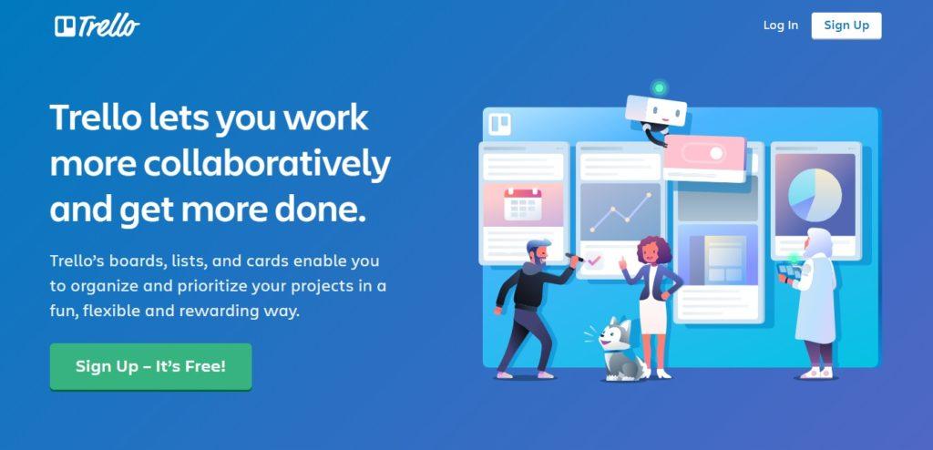
Trello– a web-based list-making application that provides fun and free ways to organize projects and plans. Their CTA is well thought and corresponds to their brand value.
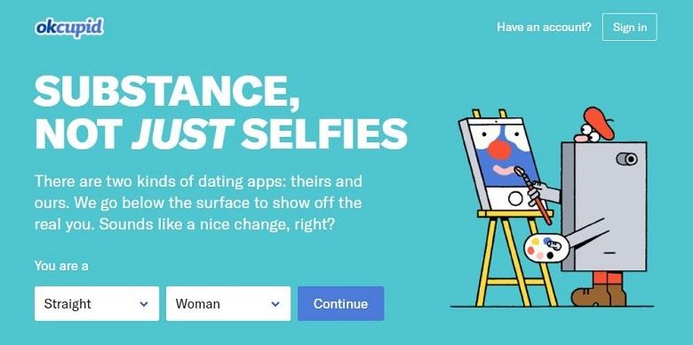
Okay, Okcupid’s campaigns have always captivated consumers and marketers with their well-thought crafty designs and efforts. Even the CTA in this campaign is worth praising for bearing a direct approach and catering to human emotions.
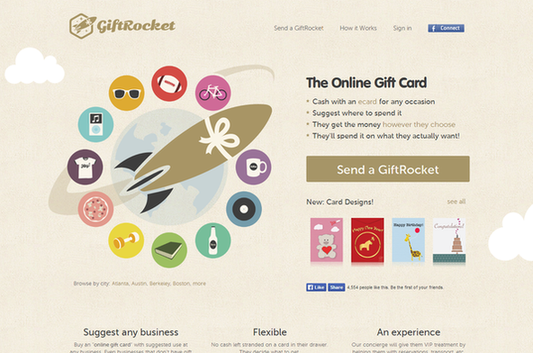
Marvelous! The perfect blend of creativity and subtlety is definitely portrayed by the creators at GiftRocket.
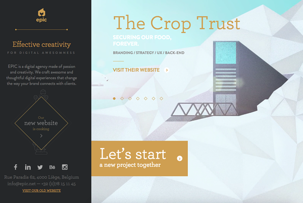
“Let’s start a new project together”- creates a sense of belongingness and the enthusiasm to connect. Displaying their earlier projects, the digital agency EPIC captivates the audience through personalized CTA and amazing designs.
Done right, your CTA can fetch you 120 times more conversions. Remember, your task does not end with just creating a CTA. Testing and optimization are required to deduce the perfect CTA and generate conversions.